

We have recently looked at the Bitcoin Fear and Greed Index and its predictive utility. However, there are other sentiment indicators out there that are well known and might be interesting to analyze. One is the Colin Talks Crypto Bitcoin Bullrun Index (CBBI). We applied the same analysis we used for the Bitcoin Fear and Greed Index to the CBBI to get an idea of its use in predicting future Bitcoin developments.
The CBBI is intriguing because it combines several well-known sub-indicators into an overall ‘confidence’ that the Bitcoin price has reached a top. Thus, the apparent hypothesis would be that high CBBI values indicate selling opportunities, while low CBBI values indicate buy opportunities. This is identical to most people’s expectations about the Bitcoin Fear and Greed Index or, actually, most other sentiment indicators.
The sub-indices that comprise the CBBI (in July 2022) are the following:
- Pi Cycle Top Indicator
- RUPL / NUPL Chart
- RHODL Ratio
- Puell Multiple
- 2 Year Moving Average
- Bitcoin Trololo Trendline
- MVRV Z-score
- Reserve Risk
- Woobull Top Cap vs. CVDD
- ‘Bitcoin’ search term (Google)
The original CBBI page links to the above sub-indices, where details on these indicators can be found.
Ultimately, the CBBI combines the sub-indicators in such a way that the ‘confidence’ value oscillates between 0 and 1
Download Data for the Bitcoin Bullrun Index (CBBI)
Luckily, the data for the CBBI can be displayed in tabular form on the CBBI website so that it can be scraped or simply copy-pasted into Libre Office. The table already contains the Bitcoin price along with the values of the sub-indicators, so that is all the data we need for this analysis. There is also an API for fetching the same data.
library(tidyverse)
library(lubridate)
library(tidylog)

cbbi <- read_delim("CBBI-2022-05-07.csv", delim = ";")
cbbi <- cbbi %>%
  mutate(
    Date = mdy(Date),
    Price = str_replace(string = Price, pattern = "\\$", replacement = ""),
    Price = str_replace(string = Price, pattern = ",", replacement = ""),
    Price = as.numeric(Price),
    Confidence = str_replace(string = Confidence, pattern = "\\%", replacement = ""),
    Confidence = as.numeric(Confidence)
  ) %>%
  select(Date, Price, Confidence)

ggplot(cbbi, aes(x = Date, y = Confidence)) +
    geom_point() +
    scale_y_continuous(breaks = scales::pretty_breaks(n = 20)) +
    geom_line() +
    theme_bw(base_size = 15) +
    ylab("") +
    xlab("") +
    ggtitle("CBBI")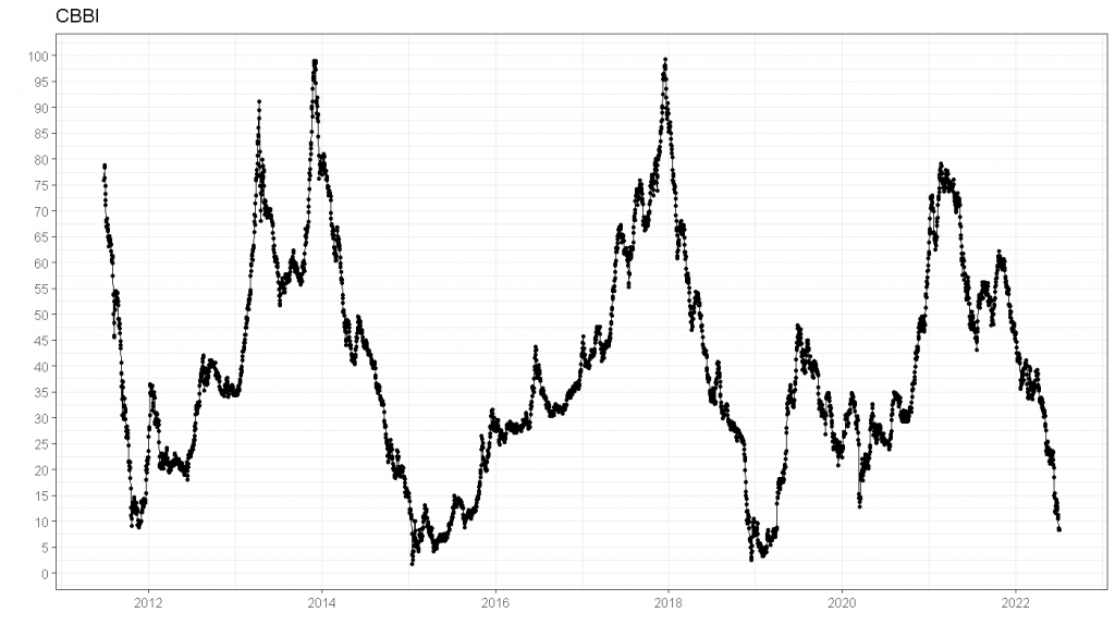
ggplot(cbbi, aes(x = Date, y = Price, color = Confidence)) +
    geom_line(size = 3) +
    geom_point(size = 3) +
    theme_classic(base_size = 15) +
    scale_y_log10(breaks = c(10, 100, 1000, 10000)) +
    scale_color_viridis_c() +
ggtitle("Bitcoin 2011-07 - today", "Log-Scale") 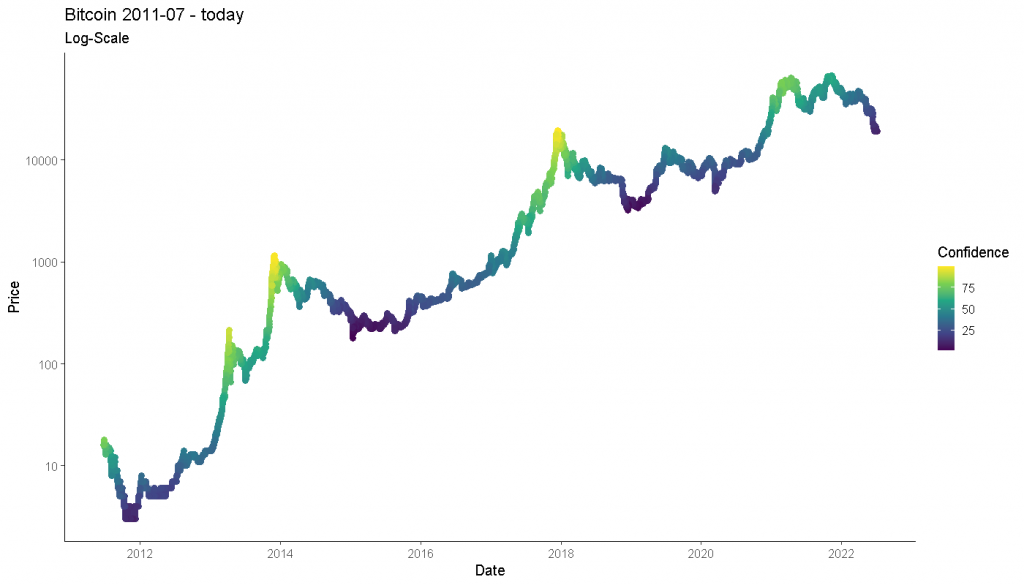
Create Lags of the CBBI and Bitcoin Price
Now we create some lags (i.e., previous values) 1, 5, …, 2200 for the CBBI. Then, in order to examine the correlation between specific CBBI values in the past with the Bitcoin price, we create similar lags of the Bitcoin price but shifted one day into the future. Thus, we can relate yesterday’s CBBI value to today’s Bitcoin price, for example.
Of course, we would like to do the same not only for one day but also for longer periods, hence the lags up to 2200 days. For example, cbbi_300 is the value of the CBBI 300 days ago, and btc_return_300 is the bitcoin return in the 300 following days. This way, we can always relate matching periods.
cbbi <- cbbi %>%
    arrange(Date) %>%
    mutate(
        cbbi_1 = dplyr::lag(Confidence, 1),
        cbbi_5 = dplyr::lag(Confidence, 5),
        cbbi_10 = dplyr::lag(Confidence, 10),
        cbbi_20 = dplyr::lag(Confidence, 20),
        cbbi_40 = dplyr::lag(Confidence, 40),
        cbbi_150 = dplyr::lag(Confidence, 150),
        cbbi_300 = dplyr::lag(Confidence, 300),
        cbbi_600 = dplyr::lag(Confidence, 600),
        cbbi_1400 = dplyr::lag(Confidence, 1400),
        cbbi_2200 = dplyr::lag(Confidence, 2200)
    ) %>%
    rename(fg = Confidence)

# Create BTC returns
cbbi <- cbbi %>%
    mutate(
        btc_return_1 = lead(Price) / Price - 1,
        btc_return_5 = lead(Price) / lag(Price, 4) - 1,
        btc_return_10 = lead(Price) / lag(Price, 9) - 1,
        btc_return_20 = lead(Price) / lag(Price, 19) - 1,
        btc_return_40 = lead(Price) / lag(Price, 39) - 1,
        btc_return_150 = lead(Price) / lag(Price, 150) - 1,
        btc_return_300 = lead(Price) / lag(Price, 299) - 1,
        btc_return_600 = lead(Price) / lag(Price, 599) - 1,
        btc_return_1400 = lead(Price) / lag(Price, 1399) - 1,
        btc_return_2200 = lead(Price) / lag(Price, 2199) - 1
    )
Scatterplots of the Bitcoin Fear and Greed Index vs. Bitcoin Price
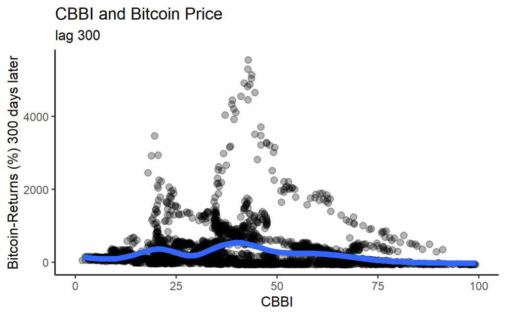
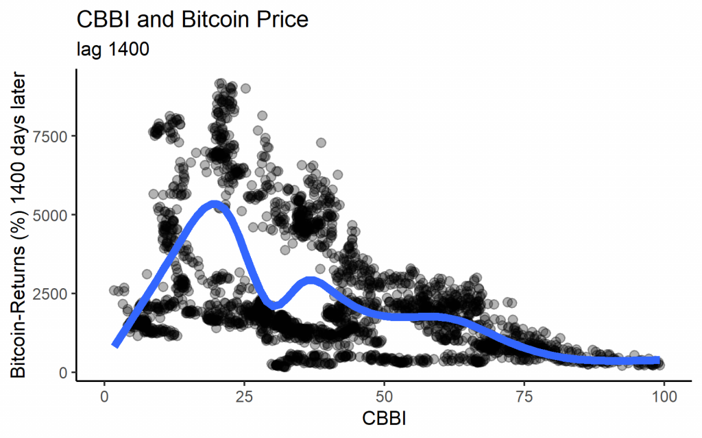
We get the following graphs if we plot the past value of the CBBI with the corresponding Bitcoin return for each day as a scatterplot. Looking at some different lag lengths, we find quite varying patterns. With lower lags, the highest Bitcoin returns were usually indicated by medium CBBI values. Nearly all of the extremely high returns are from 2013, however. With long lags, we indeed see the expected pattern that low CBBI values lead to high returns, while high values predate low returns.
The fact that only long lags show the expected correlation with the Bitcoin price is admittedly in line with the objective of the CBBI to deliver a ‘macro’ indicator that identifies the major tops and bottoms.
Note that the lag of 1400 days is roughly the time between the last Bitcoin halvings so that it may serve as an estimate of the inherent cycle length.
ggplot(cbbi %>%
         mutate(btc_return_20 = btc_return_20 * 100),
       aes(x = cbbi_20, y = btc_return_20)) +
  geom_point(size = 3, alpha = 0.3) +
  geom_smooth(size = 3, se = FALSE) +
  theme_classic(base_size = 15) +
  xlim(0, 100) +
  xlab("CBBI") +
  ylab("Bitcoin-Returns (%) 20 days later") +
  ggtitle("CBBI and Bitcoin Price", "lag 20")

ggplot(cbbi %>%
         mutate(btc_return_300 = btc_return_300 * 100),
       aes(x = cbbi_300, y = btc_return_300)) +
  geom_point(size = 3, alpha = 0.3) +
  geom_smooth(size = 3, se = FALSE) +
  theme_classic(base_size = 15) +
  xlim(0, 100) +
  xlab("CBBI") +
  ylab("Bitcoin-Returns (%) 300 days later") +
  ggtitle("CBBI and Bitcoin Price", "lag 300")

ggplot(cbbi %>%
         mutate(btc_return_1400 = btc_return_1400 * 100),
       aes(x = cbbi_1400, y = btc_return_1400)) +
  geom_point(size = 3, alpha = 0.3) +
  geom_smooth(size = 3, se = FALSE) +
  theme_classic(base_size = 15) +
  xlim(0, 100) +
  xlab("CBBI") +
  ylab("Bitcoin-Returns (%) 1400 days later") +
  ggtitle("CBBI and Bitcoin Price", "lag 1400")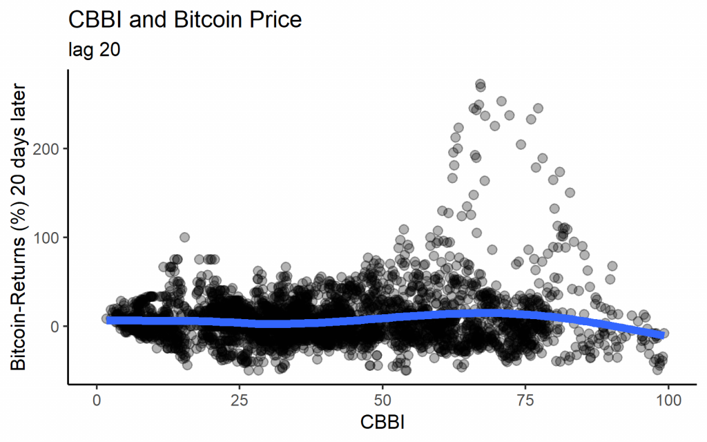
How stable is the relationship between the CBBI and the Bitcoin price?
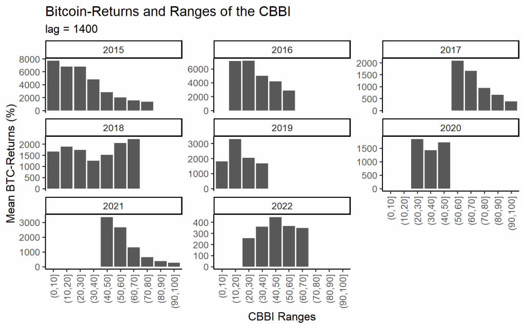
Another helpful plot for visualizing the connection between the CBBI and the Bitcoin price is the binned barplot. It depicts the mean Bitcoin return depending on the CBBI values’ range. Again, for relatively long lags of 150 or 1400 days, the correlation of the CBBI and the Bitcoin price is negative.

When separating the data into individual years, the relationship becomes more noisy, but there is still a visible negative relationship in most years.
cbbi_150_bins <- cbbi %>%
    mutate(cbbi_150_bin = cut(x = cbbi_150, breaks = seq(from = 0, to = 100, by = 10))) %>%
    group_by(cbbi_150_bin) %>%
    summarise(mean_ret = mean(btc_return_150, na.rm = T)) %>%
    mutate(mean_ret = mean_ret * 100) %>%
    ungroup %>%
    drop_na()

ggplot(cbbi_150_bins, aes(x = cbbi_150_bin, y = mean_ret)) +
    geom_bar(stat = "identity") +
    xlab("CBBI Index Ranges") +
    ylab("Mean BTC-Returns (%)") +
    ggtitle("BTC-Returns and Ranges of the CBBI", "lag = 150") +
    theme_classic(base_size = 10)

cbbi_1400_bins <- cbbi %>%
    mutate(year = year(Date)) %>%
    mutate(cbbi_1400_bin = cut(x = cbbi_1400, breaks = seq(from = 0, to = 100, by = 10))) %>%
    group_by(cbbi_1400_bin, year) %>%
    summarise(mean_ret = mean(btc_return_1400, na.rm = T)) %>%
    mutate(mean_ret = mean_ret * 100) %>%
    ungroup %>%
    drop_na()

ggplot(cbbi_1400_bins, aes(x = cbbi_1400_bin, y = mean_ret)) +
    geom_bar(stat = "identity") +
    xlab("CBBI Ranges") +
    ylab("Mean BTC-Returns (%)") +
    ggtitle("Bitcoin-Returns and Ranges of the CBBI", "lag = 1400") +
    theme_classic(base_size = 10) +
    theme(axis.text.x = element_text(angle = 90, vjust = 0.5, hjust=1)) +
    facet_wrap(~year, scales = "free_y")
Backtest of the Bitcoin Fear and Greed Index
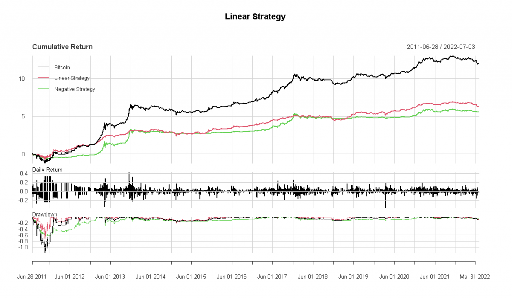
Linear Strategy
Before we move on to more realistic simulations, it is a good idea to backtest the presumed effect in as much isolation as possible. To do this, we build a linear strategy, where the Bitcoin exposure depends linearly (in the sense of a linear function) on the CBBI values. The position size should be largest at low CBBI values and lowest at high CBBI values. After all, the negative relation between CBBI values and Bitcoin returns suggests that it would be beneficial to buy Bitcoin whenever the index is low and vice versa. So, in short, we use the following formula:
Size = (100 – CBBI) / 100
Sizing the “linear” strategy
Thus, our position size automatically moves between 0 and 1. Zero would mean we hold 100% cash, and one would mean we hold 100% Bitcoin.
This is what capital growth would look like if this linear strategy was implemented. Transaction costs are not considered here, but the point is to look at the effect in isolation before we do a more realistic test.
library(xts)
library(PerformanceAnalytics)

cbbi <- cbbi %>%
    ungroup() %>%
    mutate(Exposure = (100 - cbbi_1) / 100,
           lin_size = Exposure)

ggplot(cbbi, aes(x = Date, y = lin_size)) +
    geom_line()

ggplot(cbbi, aes(x = Date, y = Price, color = Exposure)) +
    geom_line(size = 3) +
    geom_point(size = 3) +
    scale_color_viridis_c() +
    theme_classic(base_size = 25) +
    xlab("") +
    ylab("Bitcoin") +
    ggtitle("Linear Strategy") +
  scale_y_log10()

dat_bt <- cbbi %>%
    mutate(lin_strat_return = btc_return_1 * lin_size) %>%
    mutate(lin_strat_rev_return = btc_return_1 * (-lin_size + 1)) %>%
    select(Date, Price, lin_size, lin_strat_return, lin_strat_rev_return) %>%
    drop_na() %>%
    mutate(lin_strat_equity = cumprod(1 + lin_strat_return))

btc_ret <- cbbi %>%
    mutate(btc_ret = Price / dplyr::lag(Price) - 1) %>%
    select(Date, btc_ret) %>%
    drop_na()
btc_ret_xts <- xts(btc_ret$btc_ret, order.by = btc_ret$Date)
strat_ret_xts <- xts(dat_bt$lin_strat_return, order.by = dat_bt$Date)
strat_ret_rev_xts <- xts(dat_bt$lin_strat_rev_return, order.by = dat_bt$Date)
bt_xts <- merge(btc_ret_xts, strat_ret_xts, strat_ret_rev_xts)
bt_xts <- na.omit(bt_xts)
colnames(bt_xts) <- c("Bitcoin", "Linear Strategy", "Negative Strategy")

charts.PerformanceSummary(bt_xts, geometric = F, main = "Linear Strategy")
table.AnnualizedReturns(bt_xts, geometric = F, scale = 365)
In short, there is not much to see here. The strategy based on the CBBI is only marginally superior to the negative of the same strategy (buying when CBBI values are high). However, as was mentioned already, the CBBI is a macro-indicator, and this test was based on lags of one day, so maybe we have to consider a longer time frame.
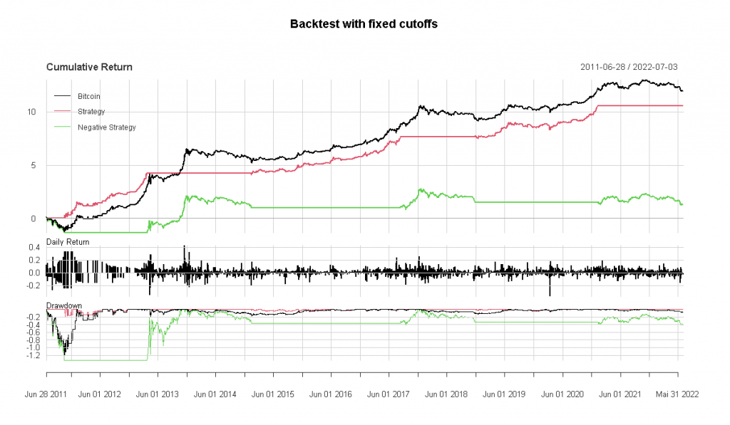
Backtest with fixed cutoff for the CBBI
In practice, one would not follow the linear strategy where one would have to adjust the position size daily, but presumably, one would choose one or more cutoffs above or below which one would then hold Bitcoin. Otherwise, one would stay in cash.
For this example, let us consider a simple strategy:
- Buy if CBBI is below 10
- Sell if CBBI exceeds 90. Then stay in cash until the CBBI falls below 10 again.
With this cutoff, the strategy would have been entirely in cash about one-fourth of the time. Presumably, this strategy is close to the intended use of the CBBI. The CBBI tries to identify blow-off tops and major bottoms; thus, such extreme cutoffs seem apt.
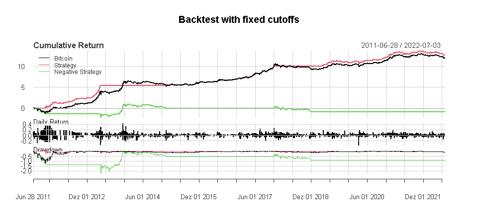
Unfortunately, the two tops of 2021 were no ‘blow-off’ tops, and the CBBI failed to identify those. With an upper cutoff of 70, the results look more appealing but now were are merely backfitting parameters to optimize the backtest to the past.
dat_bt <- cbbi
dat_bt$signal <- NA
cutoff_low <- 10
cutoff_high <- 100 - 30
dat_bt$signal <- 0
for (i in 2:(nrow(dat_bt))) {
    if (dat_bt$fg[i] < cutoff_low) {
      dat_bt$signal[i] <- 1
    } else if (dat_bt$fg[i] > cutoff_high) {
      dat_bt$signal[i] <- 0
    } else {
      dat_bt$signal[i] <- dat_bt$signal[i - 1]
    }
}

dat_bt$signal[is.na(dat_bt$signal)] <- 0

dat_bt %>%
    count(signal)

ggplot(dat_bt, aes(x = Date, y = signal)) +
    geom_area()

dat_bt <- dat_bt %>%
    ungroup() %>%
    arrange(Date) %>%
    mutate(cbbi_ret = ifelse(signal > 0.5, btc_return_1, 0)) %>%
    mutate(cbbi_ret_reverse = ifelse(signal < 0.5, btc_return_1, 0)) %>%
    select(Date, cbbi_ret, cbbi_ret_reverse) %>%
    drop_na() %>%
    mutate(cbbi_equity = cumprod(1 + cbbi_ret))

btc_ret <- cbbi %>%
    mutate(btc_ret = Price / dplyr::lag(Price) - 1) %>%
    select(Date, btc_ret) %>%
    drop_na()
btc_ret_xts <- xts(btc_ret$btc_ret, order.by = btc_ret$Date)
strat_ret_xts <- xts(dat_bt$cbbi_ret, order.by = dat_bt$Date)
strat_ret_rev_xts <- xts(dat_bt$cbbi_ret_reverse, order.by = dat_bt$Date)
bt_xts <- merge(btc_ret_xts, strat_ret_xts, strat_ret_rev_xts)
bt_xts <- na.omit(bt_xts)
colnames(bt_xts) <- c("Bitcoin", "Strategy", "Negative Strategy")

charts.PerformanceSummary(bt_xts, geometric = F,
                          main = "Backtest with fixed cutoffs")
table.AnnualizedReturns(bt_xts, geometric = F)
Generally, indices such as the CBBI face the challenge that they can only be trained on a very limited amount of market tops and bottoms. In the case of Bitcoin, we have only seen two definite blow-off tops so far.
The CBBI has been changed several times to incorporate knowledge about market developments. For example, the stock-to-flow model has been dropped from the index. The goal is to create a stable set of sub-indicators suitable for identifying market tops to form the CBBI, but of course, it can not be said whether this goal can ever be achieved.
Given that the CBBI was just recently modified, the out-of-sample period for judging its performance really starts only now. Lastly, we would like to commend the author of the CBBI for being very transparent by open-sourcing the code and data.